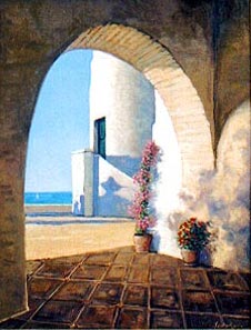
Carlos & Gino Santa Maria
Flower Pots. Oil on linen 16" x
20"
Copyright © 2003 All Rights Reserved.
The split complementary scheme is one of the most popular color systems among artists because of its versatility and the pleasant atmosphere it creates. In reality, it is a variation, or expansion of the complementary scheme, where the spectrum of the complementary spreads to a broader area. It uses a color and the two colors to both sides of its complementary. This yields high contrast without the aggressive force of the complementary scheme.
In order to maximize results avoid using warm low saturation colors such as browns and dull yellows. The key is to use vibrant, somewhat aggressive split complementary colors. If you the result is too aggressive, gray them out until you get the desired balance.
For the painting on the left, this is the scheme used:
Where blue is the predominant color, and instead of using orange as its complementary, we used yellow-orange and red-orange. Of course, both split complementary were used in a subtle, yet rich hues.